So, while I’m in a blogging mood I should show you a few things I’ve been doing. Yes, I have been around but I just haven’t been inspired to blog. It seems like everything has been blogged about a million times already, and the only use for me blogging those things is to increase my google ranking… which I’m soooo not interested in any more.

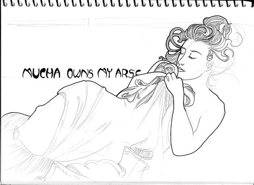
I went back to my Mucha book after talking about his works with a friend. First I tried to do a straight out copy of “Dusk” because I just love the lines in her hair and the draping of the sheet.

It didn’t turn out too well, but all wasn’t lost. I gained an even huger respect for his drawing ability – does that even make sense?! Who can draw draping like that? I mean, really!

I have always been fascinated with puppetry and started doodling the marionette girl dangling from the hands of a scary woman I clipped out of a magazine. Then I thought about it a bit more and decided that another little child needed to be controlling her. Oh, creepy childhood themes….! (This is available as a t-shirt and a print.)

My friend Sonya’s birthday came up and I really wanted to draw her as a sailor girl after seeing her in a cute sailor-esque kind of outfit. She said she really liked it! I hope she did :)

I am a sucker for all things Mucha, and that extends to things inspired by his work. I even use a Mucha style photo morph of myself, as an avatar on most sites.
He had such a way with lines & curves, that draws the eye in and makes you follow every one of them, like a maze in which you are not seeking the exit and just want to get lost in. His use of color enhanced that.
I think more than the way he did fabric draping, I am more drawn to how he did women’s hair.
I think this is the part of your marionette image that is appealing to me. It’s her hair. But I think it’s a bit too busy outside of the main image and that is a bit more of a distraction than an enhancement. You can’t get lost in her hair when the rest of the image is pulling you away.
The image of your friend as a sailor girl…her eyes draw you in…the expression…she looks like she is ready to cry. You did much better with this one. As simple as it is drawn, it’s full of emotion and the longer you look at it, the more you want to hug her and tell her “Don’t cry, everything will all be ok”.
And the background pushes your eyes to her, rather than drawing you away. Much better than the marionette image. Great work.
I really did! I totally showed everyone. :D
The pick for Sonya is totally awesome and is one of my favourites.
wow you are awesome!