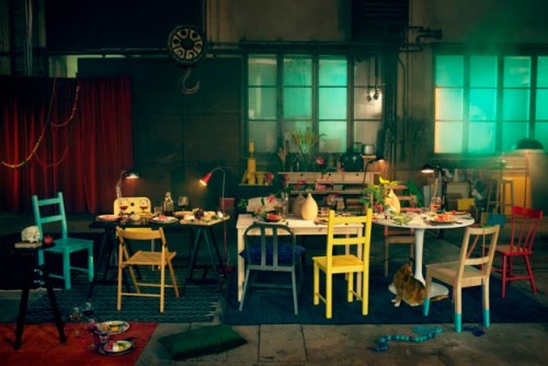
Pip at Meet Me at Mikes posted some of Lo Bjurulf’s interior styling work and I was in love. I’m a fan of mismatched, childish, chaotic things and I think being invited to this dinner party would be a lot of fun. Sometimes we are so taken with what we ought to buy and posses as Proper Adults to impress other Proper Adults, especially when it comes to etiquette and entertaining, and we forget that spending time with people we like should be honest and loving and not furnished with things bought specifically to impress. We are so impressive to our loved ones anyway, without all that stuff.
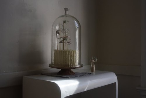
Herriott Grace are a daughter and father business and they have an adorable story behind their web store that you should go read. Everything has been sold out in the store for ages, but it’s worth a look just for the styling – and these cake flags are totally on my To DIY list. I’m very interested in getting that tall cake cover in the picture. Very.
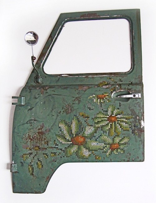
It should be no surprise to you that I adore craft that uses wasted objects, especially when a masculine object is embellished with a traditionally feminine craft. This piece is called “Way of Roses” and it was made by Severija Inčirauskaitė-Kriaunevičienė.
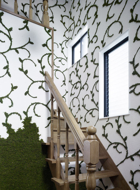
Fulfilling my need for at least one example of vertical garden per each Friday Fance is this wallpaper that is formed by cultivating designs in moss. Check out this Design*Sponge post on Oki Sato‘s house, featuring this ingenious moss wallpaper designed by his partner, Asami Kiyokawa.
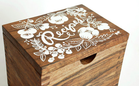
Rifle Paper Co.’s recipe boxes are lovely and made by local craftspeople using locally salvaged hardwood, and that’s all very nice but I really want to get my hands on some wooden cigar boxes now and doodle on them!

Thanks for the reminder that it is all too easy to
“forget that spending time with people we like should be honest and loving and not furnished with things bought specifically to impress. We are so impressive to our loved ones anyway, without all that stuff.”
Wise words along with a bit of whimsy- Nice.
Love the moss on the wall.
Lushe
http://www.lushe.com.au
Gosh – I adore that recipe box. Wonder if someone in Australia does similar things?
I'm with you on interior design for interior design's sake. I want to walk into someone's house and see how THEY are and what THEY like, not what is in the latest Freedom catalogue. I thought about my style again this morning when I was reading the design section of the paper – “what's in this winter in interior design” and I wondered if people really changed their style around each season? I quite like the fact my lounge room has happily looked the same for 4 years!